6/9/2021
Catalog Launch
Flying Colors
Curated by Dion Johnson
Rema Ghuloum | Dion Johnson | Pamela Jorden | Heather Gwen Martin | Michael Reafsnyder
April 29 – June 10, 2021

Flying Colors catalog now available!
Flying Colors is a group exhibition featuring five painters from Southern California: Rema Ghuloum, Pamela Jorden, Heather Gwen Martin, Michael Reafsnyder, Dion Johnson. Each artist embraces color and abstraction, and the works are united by chromatic exploration and discovery.
Southern California has a rich history of art movements from the second half of the 20th Century that distinguish it from New York and Europe. Beyond the warm climate, Modernist architecture, the motorcycle and surf life, and the early aerospace and entertainment industries that influence Southern California culture, there is a freedom to make something out of nothing, to pursue new ideas in art. Hard edge painting, geometric abstraction and California Minimalism are just a few of styles born there that continue to be interpreted by younger generations of artists. Perception and interest in light and space are concerns of this group of artists, along with notions of action and movement. While these ideas are investigated by artists around the world, the confluence of the unique environment, community and history set their art apart.
The show is full of small works, each a powerful little gem. Dion Johnson selected some of the most compelling abstract painters in Southern California that push painting forward and establish what California abstraction is today. The resulting show is simply gorgeous, one that demonstrates why LA is still one of the most important art centers.
Below you will find excerpts from the catalog essay written by Dion Johnson about his contemporaries.
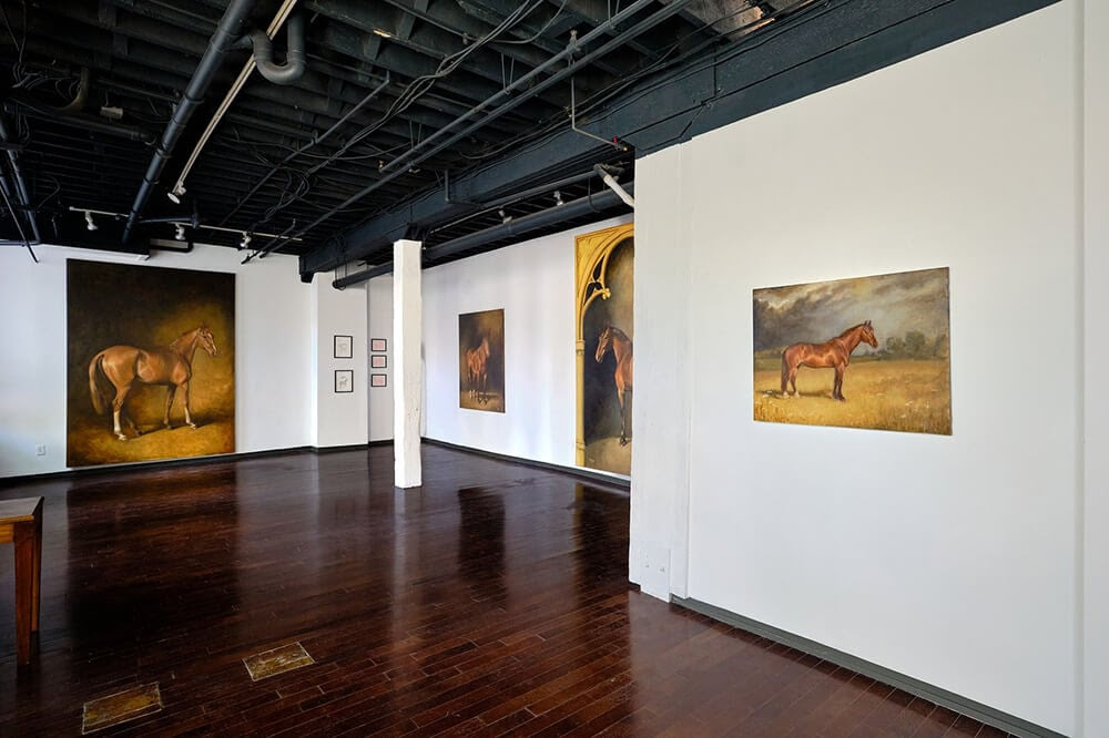
Flying Colors catalog in action
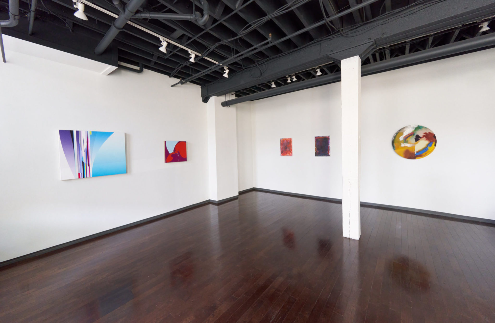
Installation view of Flying Colors at Contemporary Art Matters

Heather Gwen Martin’s paintings can fly. Second Glance 2019 defies gravity as three large shapes – one light blue, two bright red – twirl, glide, and float above a vast violet field. Appearing to be equal parts weightless liquid and propeller blades, these crisp hard-edge forms emanate from the center of the canvas and sprout slender tails. These delicate but determined appendages grow, detach, and intertwine in midair. As we step back to view the entire painting, we can see Second Glance in flight powered by idiosyncratic energy and ebullient colors.
Often composed with only a handful of shapes and colors, Martin’s paintings are deceptively complex and always in motion. The dynamics of carefully chosen elements range from clumsy and bashful to acrobatic and elegant. In her world, combinations of colors and shapes seem endless, and the relationship of trajectory and space continually evolves. I’m not quite sure where her paintings are from or where they might be traveling to, but their unpredictable movement captures our attention and makes us wonder.

Pamela Jorden makes paintings on shaped canvases. They may have an asymmetrical configuration combining angular and curved sides, or they may be a perfect circle. These concave and convex edges imply lenses and apertures. Looking at the segueing colors of Jorden’s circular-shaped painting Blue Arc 2020, I recall a childhood memory of holding a cat’s eye marble – fascinated by the sphere’s chromatic structure. Blue Arc’s composition dials clockwise and counterclockwise; these simultaneous and seemingly contradictory movements pull us in and set our eyes in motion. A vaporous yellow seems to envelop other stained hues and marks except for a defiant blue arc that orbits near the circumference. As I think about a colorful gaseous atmosphere and an orbiting movement, my thoughts teleport 500,000,000 miles away, and I imagine gazing at cloud patterns on the surface of Jupiter. Paintings can trigger a memory like time travel and stimulate our perception like teleportation.

Paintings can supercharge our reality. Revved up and ready to go Michael Reafsnyder’s canvases shimmer and vibrate. Gesturally applied wet into wet color defines the sliding and skipping surface of Swami’s Break 2020. This painting seems to amplify the idea of bright sunlight glistening across a greenish-blue ocean as cool water sprays and wet waves crash. Wedge Ride 2020 is pure momentum. Blues, magentas, oranges, and yellows slip and accelerate on different planes of shallow space that intersect, disappear, and re-emerge. Without a defined start/stop or entrance/exit, this painting stimulates our senses by dropping us into the middle of an exciting ride.
The notion of what you put into something is equal to what you get out of it holds true with Reafsnyder’s painting practice. Powered by whimsical joy and playful humor, each canvas is a unique event where liquid color smears, slippery material smushes, and wet paint glops. A carefree openness is fully synchronized with a razor-sharp awareness of how to move, react, and navigate into uncharted territory. Every painting is an energetic adventure, and the viewer is an active participant gazing at delightful spectacles and peering into supercharged experiences.

Painted with many thin translucent layers, Rema Ghuloum’s canvases present rich color fields. I think of her pieces as evolving environments where the effects of light, color, and space can alter our perception and heighten our senses. Brightly stained around the edges with a shadowy center, Lovers 2020-2021 is romantic chemistry in action. This painting’s saturated hues appear to be mixing on the surface with curving fluid paths to create a private nocturnal space. Ghuloum creates places that we’ve never seen before that somehow feel familiar and welcoming like a dream or déjà vu. Color is the defining element of these atmospheres where spatial shifts occur from piece to piece; some works appear to be miniature stages with vivid lighting and mysterious backdrops, while others seem to be aerial views that stretch and expand well beyond our periphery. The fiery orange and radiant red pallet of Red Moon 2019-2021 alludes to the luminous glow of a rare astrological alignment. Lover’s intimate setting and Red Moon’s magical light show us that paintings can enhance our emotional and environmental awareness.

Dion Johnson uses color to evoke the contemporary urban, digital and natural landscape of Southern California, and skews the vocabulary of abstraction into a hybrid techno-language. His work is a clear balance of the harmonic and dissonant qualities in our environment. David Pagel wrote in a catalog essay:
“These seemingly calm arrangements of gently curved shapes, in a sumptuously saturated and wildly unnatural palette, are anything but wallflowers. They play with scale like nobody’s business, filling the empty space around them with inclusive, user-friendly snippets of imagined symphonies… Time does not stand still in these paintings so much as they suspend you in long drawn-out moments of acutely satisfying attentiveness.”